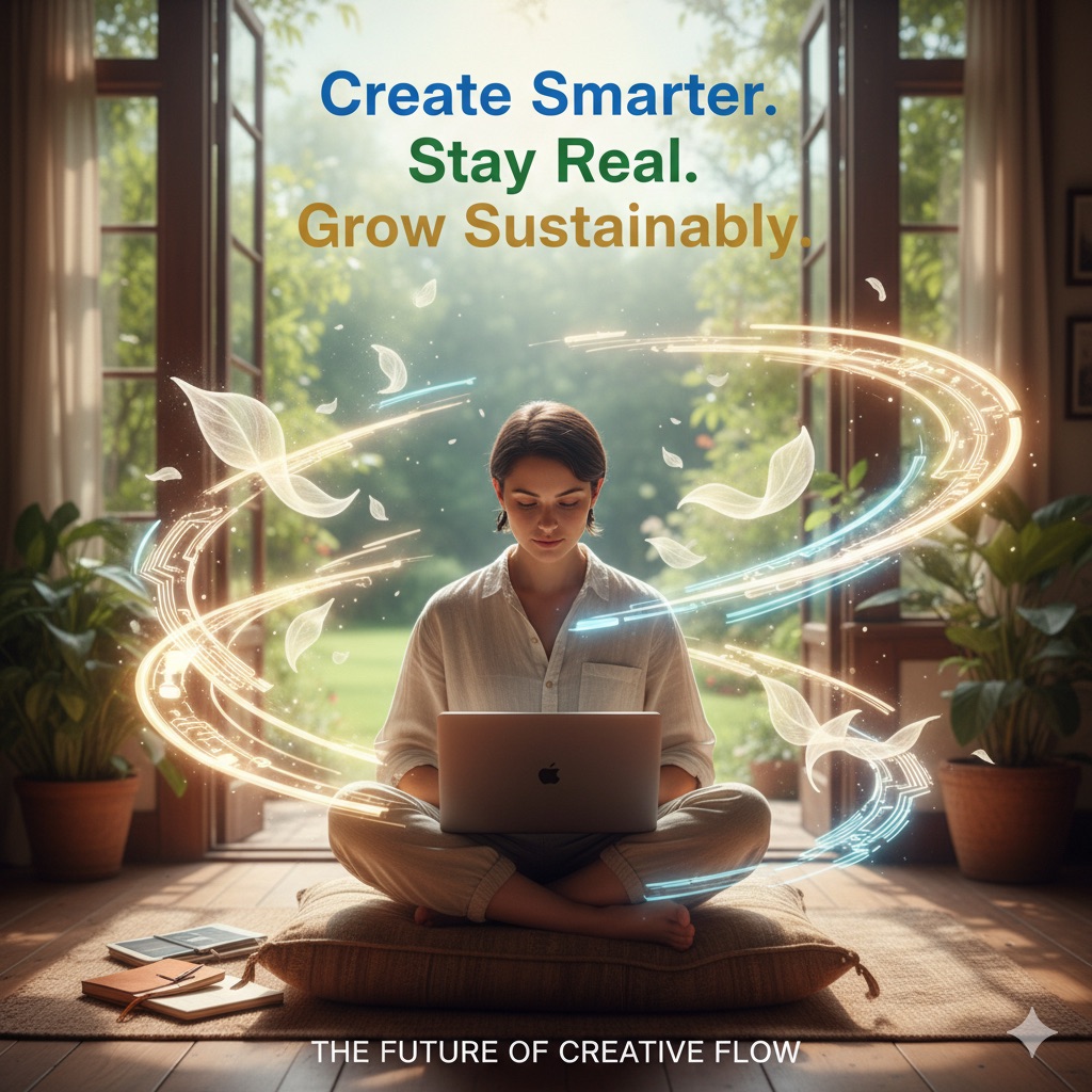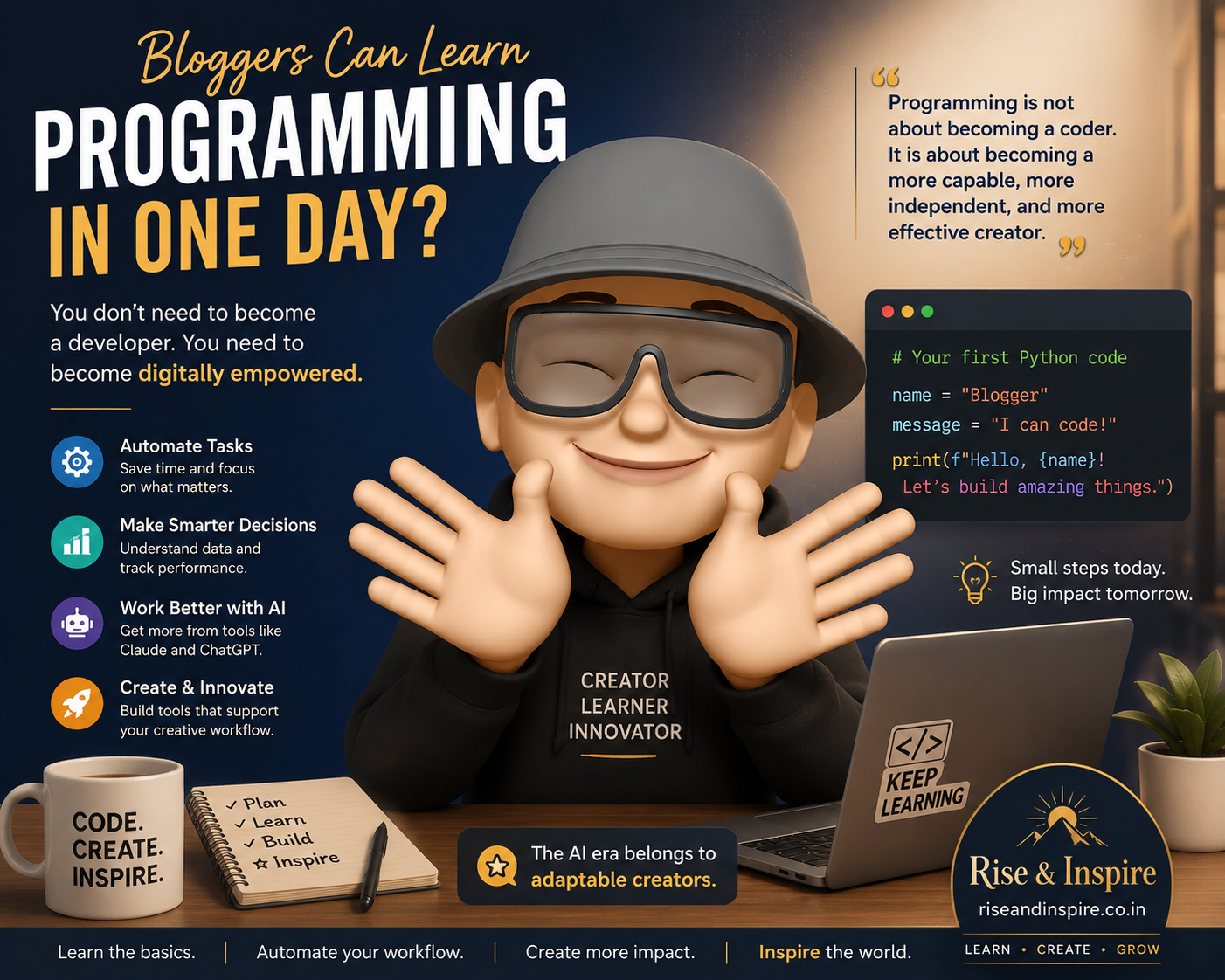
You have been writing for the web. Now it is time to learn how the web actually works. Programming is not a foreign language reserved for engineers. For bloggers in the AI era, it is simply the next skill on the list.
A Practical Guide for Content Creators in the AI Era
Rise & Inspire | riseandinspire.co.in
For most bloggers, the word “programming” can feel like the door to another world — a world that belongs to software engineers, data scientists, and technology professionals. The very sight of code on a screen can appear intimidating, even impenetrable.
But that perception is rapidly changing. And in today’s AI-driven digital world, it needs to change — because the future of content creation belongs to those who dare to learn.
You do not need to become a developer. You need to become digitally empowered.
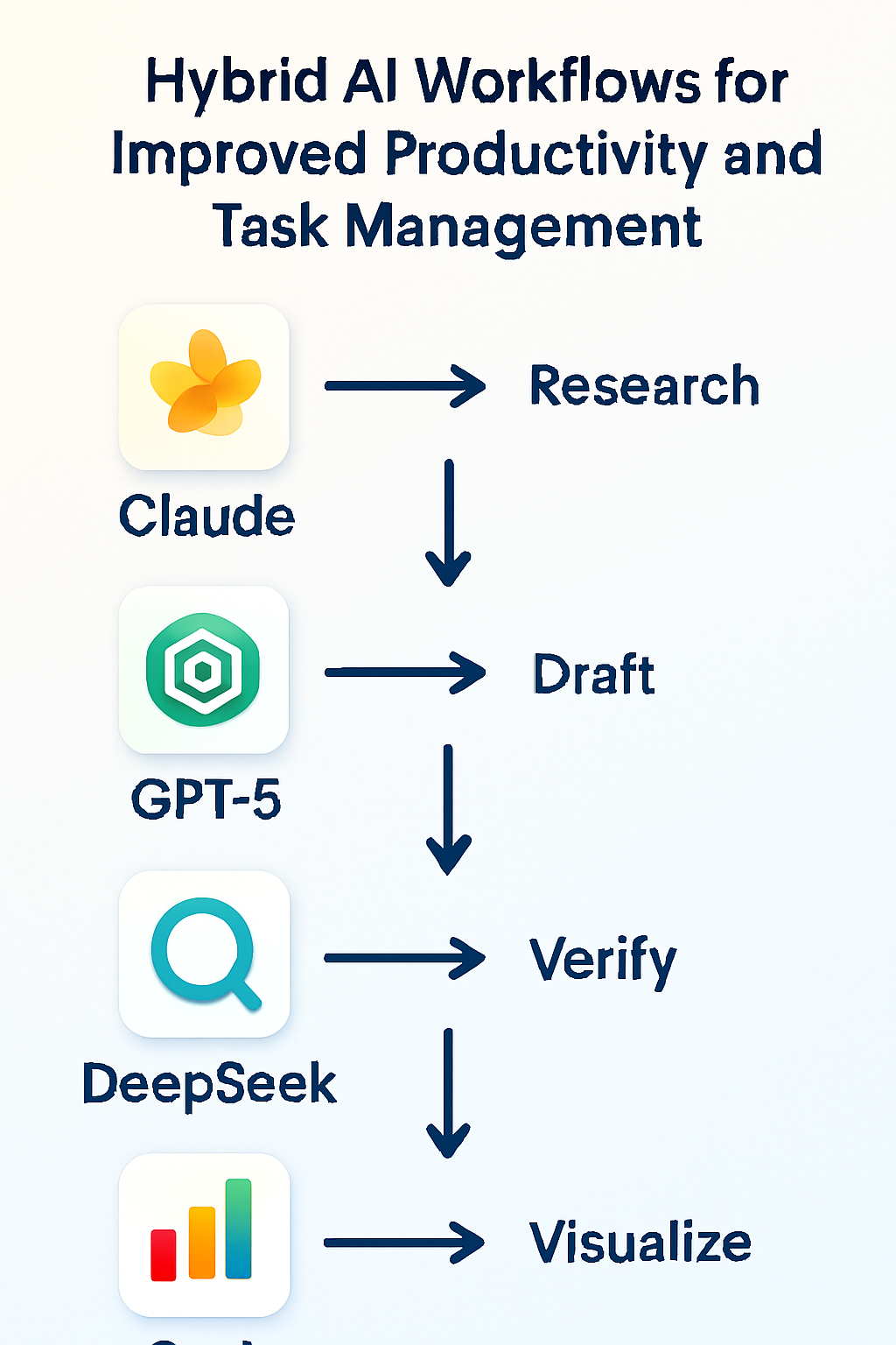
The encouraging truth is this: you no longer need years of training or an engineering degree to benefit from programming. Even a foundational understanding of coding can significantly improve how you manage your blogging workflow, automate repetitive tasks, enhance your productivity, and interact more effectively with AI tools like Claude and ChatGPT.
And yes — you can genuinely learn the fundamentals of programming in just one focused day. Not mastery. But enough to begin transforming everything.
Why Every Blogger Should Care About Programming
Modern blogging is no longer limited to writing articles alone. Today’s content creators manage multi-layered digital operations that touch technology at every point. Consider what goes into a single published post:
• SEO optimisation and metadata management
• Social media distribution across multiple platforms
• Image organisation and compression
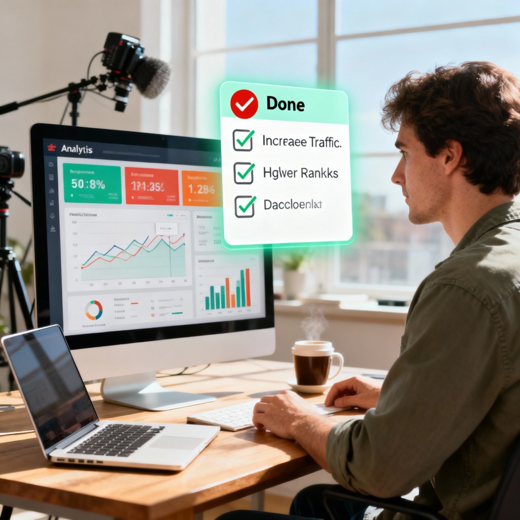
• Analytics tracking and performance review
• AI-assisted content generation and editing
• Research workflows and source management
• Newsletter systems and subscriber engagement
• Content archiving and version control
• Automation of repetitive formatting tasks
Many of these activities are repetitive, time-consuming, and entirely automatable. Basic programming knowledge is the key that unlocks that automation.
✨ The Rise & Inspire Perspective: Programming is not about becoming a coder. It is about becoming a more capable, more independent, and more effective creator. It is a spiritual discipline of stewardship — using the tools available to you wisely.
The Biggest Myth About Programming — Debunked
The most common misconception that keeps talented people away from programming is this: that it requires advanced mathematics, engineering degrees, or complex technical expertise.
It does not. Not for the level that will genuinely serve you as a blogger.
Basic programming is fundamentally about:
• Giving precise instructions to a computer
• Solving small, clearly defined problems
• Automating tasks you already do manually
• Organising logic into repeatable sequences
In many ways, programming resembles structured writing. If you are a blogger, you already understand sequence, structure, flow, organisation, and communication. These skills transfer surprisingly well into the world of code.
Writers already think in structure. Programming is simply structure with instructions attached.
Why Python Is the Perfect Starting Point for Bloggers
If there is one programming language designed for people who value clarity, simplicity, and practical results, it is Python. Here is why Python is widely recommended for non-technical beginners:
• Its syntax reads almost like plain English
• It requires no complex setup to begin
• It is used extensively in AI applications, automation, data analysis, and web tools
• It has one of the largest, most supportive beginner communities in the world
For bloggers especially, Python opens doors to tools that make your creative work faster, smarter, and more impactful. It is the language of the AI era — and learning even its basics puts you in excellent company.
What You Can Realistically Learn in One Day
A focused learning session of several hours can help you genuinely understand the core building blocks of programming. These are not trivial concepts — they are the foundation upon which everything else is built.
| Time | Topic | What You Learn |
| Hour 1 | How Code Works | How computers read instructions; your first print() command |
| Hour 2 | Variables | Storing and recalling information in your programme |
| Hour 3 | Conditions | Making decisions with if/else logic |
| Hour 4 | Loops | Automating repetition with for and while loops |
| Hour 5 | Functions | Organising reusable blocks of code |
| Hour 6 | Your First Project | Building a small tool relevant to your blog workflow |
Once these building blocks become familiar, coding stops feeling like a foreign language. It begins to feel like a tool you own.
How AI Changes Everything About Learning to Code
Here is where the landscape has shifted dramatically in favour of self-taught learners.
In the past, learning programming typically required expensive courses, dense technical books, or formal classroom instruction. The barrier was high. For most bloggers, it simply was not accessible.
Today, AI tools like Claude and ChatGPT function as your personal:
• Patient, always-available tutor
• Coding assistant who writes examples on demand
• Debugging partner who explains errors in plain language
• Practice generator who creates custom exercises for your level
• Encourager who adapts to the way you learn best
You can simply ask:
“Explain this like I’m a complete beginner.”
“Why is this code not working?”
“Create a small practice project for a blogger.”
“Teach me this concept step by step.”
The AI era has not just made programming easier to learn. It has made it possible for every motivated person to begin — today.
What Bloggers Can Actually Build
This is the moment when programming becomes genuinely exciting. After just one day of focused learning, bloggers can begin building small tools that make a real difference to their creative work. Here are some examples:
• A blog title generator that produces ten headline options from a keyword
• A word counter that tracks article length and reading time
• An SEO keyword frequency tool that analyses your draft
• A quote generator that pulls from a saved library of your favourite lines
• A Scripture organiser for daily devotional or reflection posts
• A social media caption helper that formats posts for different platforms
• A content idea system that logs and retrieves post concepts
Notice that each of these tools is connected to something a blogger actually does every day. That connection is the secret to sustained motivation.
✒ One-Day Challenge: At the end of your first learning session, build one small tool that solves one real problem in your actual blogging workflow. That first working programme will change how you see yourself.
Why Real Workflows Make All the Difference
One of the most common reasons beginners give up on programming is that they learn abstract concepts disconnected from anything they actually care about. They memorise syntax but never feel the satisfaction of solving a real problem.
Bloggers are uniquely positioned to avoid this trap. Your creative work gives you an immediate, personal context for every concept you learn. When a loop automates something you used to do by hand, you feel it. When a function organises your content ideas, you see it.
Programme your own world. Your article archives. Your metadata. Your research notes. Your content calendar. Your formatting workflow.
When coding connects directly to your everyday creative work, it stops being a subject and starts being a superpower.
Where to Begin: Free Tools, Zero Installation
One of the most common obstacles for beginners is the technical complexity of setting up a coding environment. The good news is that you can begin coding immediately in your browser, with no installation required.
Two excellent free platforms to start with:
• Replit (replit.com) — A full coding environment in your browser, ideal for Python beginners
• Google Colab (colab.research.google.com) — Google’s free notebook-style Python environment, excellent for learning and experimentation
Open either platform, type your first line of code, press Run, and you are already a programmer.
print(“Hello World”)
That single line is not trivial. It is the beginning of a new way of thinking about your work.
An Honest Word: What One Day Will and Will Not Give You
Let us be clear and honest, because Rise & Inspire is always about truth that empowers, not hype that disappoints.
Learning programming in one day will not make you an expert developer. It will not replace the depth of study that professional programmers bring to their craft. There is a long road ahead if you wish to travel it.
But one focused day can absolutely give you:
• Genuine confidence that you can do this
• A foundational understanding of how programmes think
• Practical skills you can use in your blogging workflow this week
• A starting point for continuous, joyful growth
The goal is not perfection. The goal is the first step taken with courage and intention.
Rise and Inspire: The Future Belongs to the Adaptable
The digital world is evolving at a pace none of us fully anticipated. For bloggers and content creators, this evolution is not a threat — it is an invitation.
Basic programming knowledge can unlock greater efficiency, smarter workflows, deeper AI integration, and a level of digital independence that was simply not available to content creators a decade ago.
Programming is no longer only for engineers. It is becoming a creative skill, a professional asset, and a form of digital stewardship for anyone who communicates ideas in the modern world.
And when bloggers connect coding to their own personal workflows, their own creative systems, their own daily challenges — learning becomes not only easier, but genuinely rewarding.
The future of content creation belongs to those who combine creativity, structured thinking, AI tools, and digital adaptability. Learning basic programming may be one of the wisest investments you make this year.
Rise and inspire. Begin today.
Have you ever tried to learn programming? What held you back — or what helped you begin? Share your experience in the comments.
Subscribe to Rise & Inspire at riseandinspire.co.in for daily reflections on faith, productivity, technology, and the life well-lived.
K. John Britto
Founder
Rise & Inspire
Explore more at the Rise & Inspire archive | Tech Insights |
© 2026 Rise & Inspire. Follow our journey of reflection, renewal, and relevance.
Website: Home | Blog | About Us | Contact| Resources |Word Count:1656